I have a #sqlhelp question that requires some code. So hey, blog post time!
TL;DR: the geometry::STGeomFromText graph provides too wide a range for the X-axis, for a large variance of Y-axis values. Is there a way to limit the X-axis range?
Update: We have an answer! Thanks MJ!
Yeah, the spatial results tab is pretty limited in what it can/will display. It always keeps the ratio of x units to y units at a 1:1 ratio. The best it can do then is zoom or shift, but it can't stretch the x axis without the y axis.
— Michael J Swart (@MJSwart) September 27, 2018
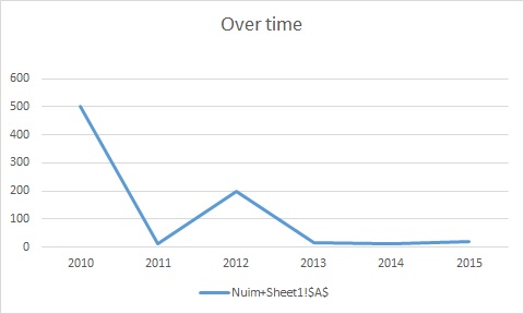
I’m playing with a geometry query based on this article. The query is meant to take inputs from a table, and generate a line graph of amounts over time. Something like this:
But when I run the following code:
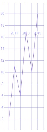
create table #tmp (Yr varchar(4), nm varchar(4))

insert into #tmp (Yr, nm)

values (2010, 10),

(2010, 500),

(2011, 11),

(2012, 200),

(2013, 17),

(2014, 10),

(2015, 20)
DECLARE @WK VARCHAR(8000)

SET @WK =

STUFF(

( SELECT ',' + Yr + ' ' + Nm

FROM #tmp

ORDER BY Yr

FOR XML PATH('')), 1, 1, '');

SELECT geometry::STGeomFromText( 'LINESTRING(' + @WK + ')', 0 );
…I get a graph that is basically a vertical line:
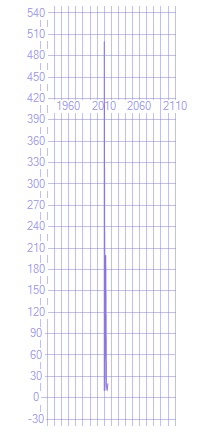
It’s not truly a vertical line. When I zoom in, I can see that this graph actually represents all the numbers…it’s just that there is a VERY LARGE difference between 10 and 500, the minimum and maximum values. And the graph, for some reason, decides that we also need a REALLY WIDE x-axis range (from before 1960 to after 2110). The graph is unreadable.
If I reduce the larger values down, I do get a usable graph…but of course, it doesn’t represent reality:
So, here’s the “Too Long;Didn’t Read”: The geometry::STGeomFromText graph provides too wide a range for the X-axis, for a large variance of Y-axis values. Is there a way to limit the X-axis range?
Thanks for playing along!